Editorial CMS
Designing for the people behind the content.
Reimagining the Money.com editorial CMS through research, workflow design, and ongoing validation.
My Role
Product Design Lead, Product Manager, Design System Owner
Tools
Figma, Claude Code

The project at a glance
An in-house publishing platform built around the Money.com editorial team.
The Product
Editorial CMS
A custom CMS to replace WordPress as Money.com’s authoring and content-serving layer.
The Users
Editorial teams
Writers, editors, art direction, and
stakeholders involved in publishing and distribution.
stakeholders involved in publishing and distribution.
My Focus
Product design + product
management
management
Led discovery, prioritization,
sprint planning, Figma design
system, AI-assisted prototyping,
testing, and developer handoff.
sprint planning, Figma design
system, AI-assisted prototyping,
testing, and developer handoff.
Why change the CMS?
The problem was bigger than the interface.
WordPress supported publishing,but the experience had
accumulated complexity
accumulated complexity
Custom fields and plugins increased
maintenance risk.
maintenance risk.
Common editorial tasks required workarounds
or separate tools.
or separate tools.
The interface did not always reflect how the
team actually worked.
team actually worked.
The challenge: continuity + opportunity
Replace a critical system without losing what already works.
Non-negotiable
Publishing parity
Preserve live content, URLs, layouts, SEO, syndication, and the editorial workflows that exist today.
Design opportunity
A better experience
Use the transition to learn where the workflow breaks down and shape a simpler, more flexible future.
I started with the people using it
The first step was understanding the work—not drawing screens.
Discovery questions
What do you do every day?
Where do you leave the CMS?
Which tasks feel repetitive or risky?
What would you change first?
Different roles, different jobs
A shared platform must support different definitions of a good day.
Writers
Create
Draft, format, enrich, and update stories with fewer tool switches.
Editors
Review
Understand changes, coordinate feedback, and publish confidently.
Art / Design
Present
More control over imagery, layout, and page aesthetics.
Distribution
Adapt
Ensure content and metadata work across channels.
What I heard, again and again
Different interviews surfaced a common pattern of friction.
Components
Time lost creating shortcodes for components and ad’s on a different platform then pasting them into Wordpress
Collaboration
Comments and change tracking outside the editor using Google Docs
Findability
Difficulty finding existing content
Flexibility
Limited tables, visuals,
embeds, and layout control
embeds, and layout control
Updates
Cloning and temporary-URL
workarounds
workarounds
Syndication
Channel metadata and rich-
content compatibility
content compatibility
A publishing journey across multiple tools
The handoffs were as important as the screens.
Draft
Google Docs
Transfer
Paste / clean HTML
Enrich
NavChain + media
Review
Feedback / changes
Publish
Checks + syndication
Insight
A better CMS did not mean more features. The real opportunity was to reduce unnecessary handoffs and make essential editorial work feel native, intuitive, and connected.
From requests to underlying needs
Feedback synthesis; product judgment turned themes into actionable needs.
“Make components easier”
Create and reuse elements without switching tools

“I need comments”
Keep review context attached to the article
“Search is difficult”
Find and resume work quickly
“More control over pages”
Support storytelling without a complex page builder
Prioritize the problem, not the wishlist
Weekly reviews with the Chief Experience Officer and lead developer aligned priorities, feasibility, and sprint scope.
Working principles
01 Protect publishing parity.
02 Prefer simpler existing infrastructure.
03 Keep the writing surface focused.
04 Stage advanced capabilities over time.
AI as a workflow accelerator
I used AI to move faster without outsourcing product decisions.
Research Synthesis
Consolidated writer and editor
feedback with AI, identifying
recurring friction and grouping
needs into themes.
feedback with AI, identifying
recurring friction and grouping
needs into themes.
Product Decisions
Reviewed findings weekly with
the Chief Experience Officer
and lead developer to
evaluate feasibility and set
priorities.
the Chief Experience Officer
and lead developer to
evaluate feasibility and set
priorities.
Rapid Validation
Translated Figma designs into
a functional Claude AI
prototype, enabling early
hands-on usability testing.
a functional Claude AI
prototype, enabling early
hands-on usability testing.
Structure before polish
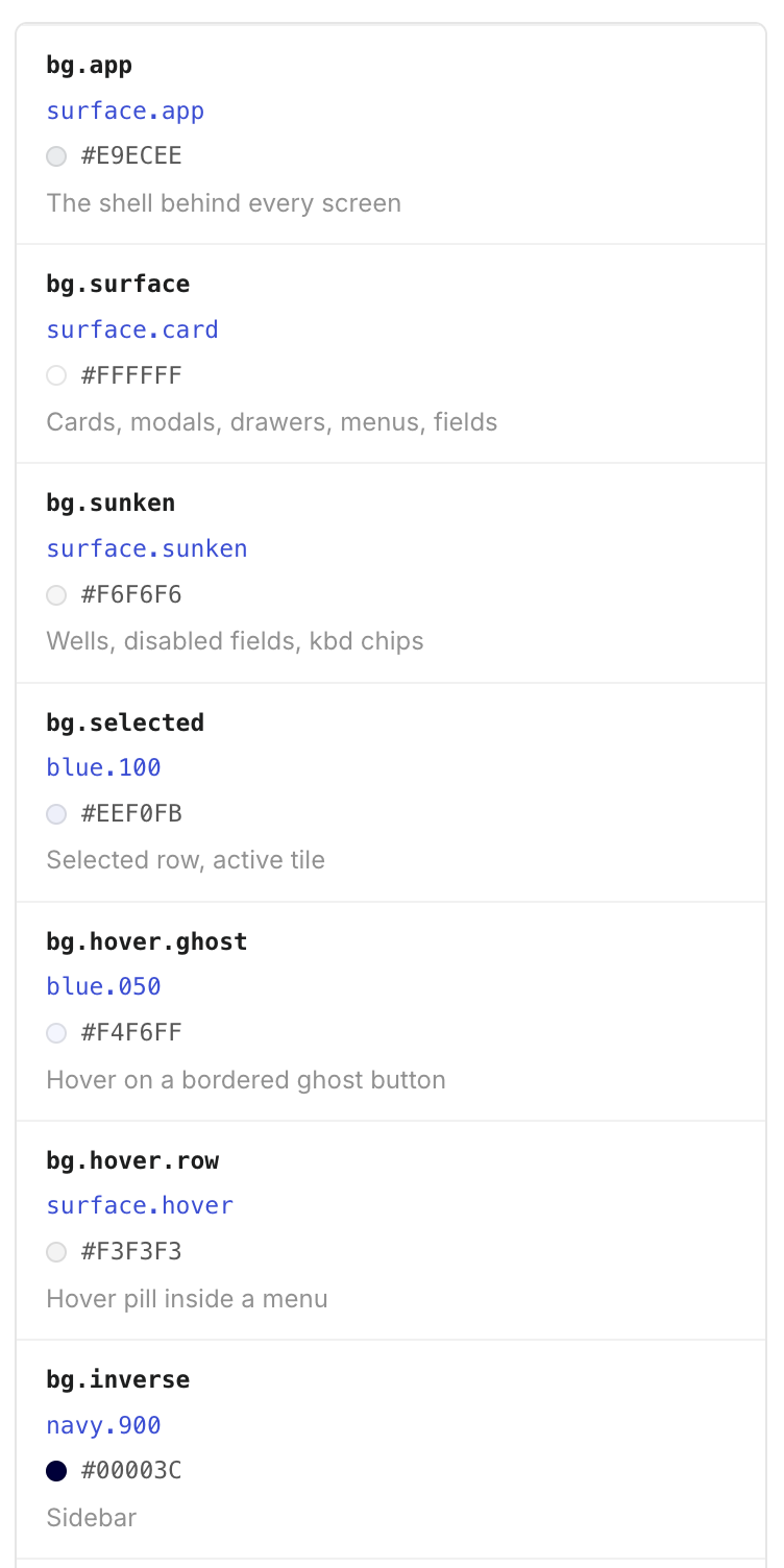
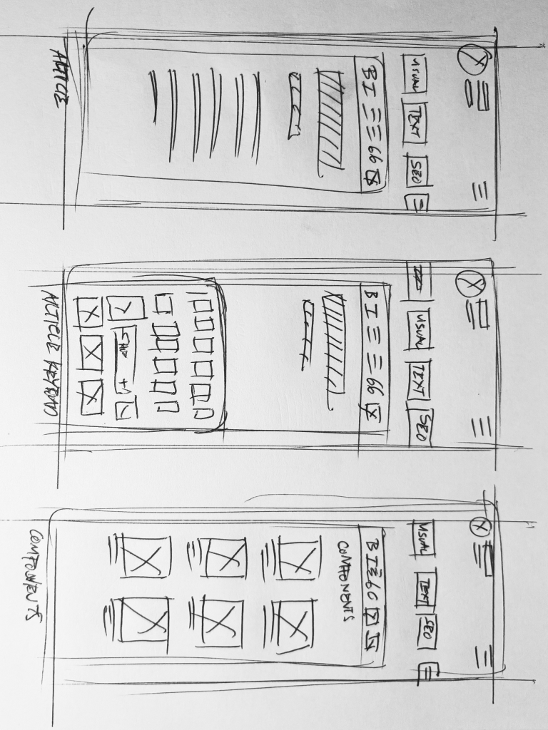
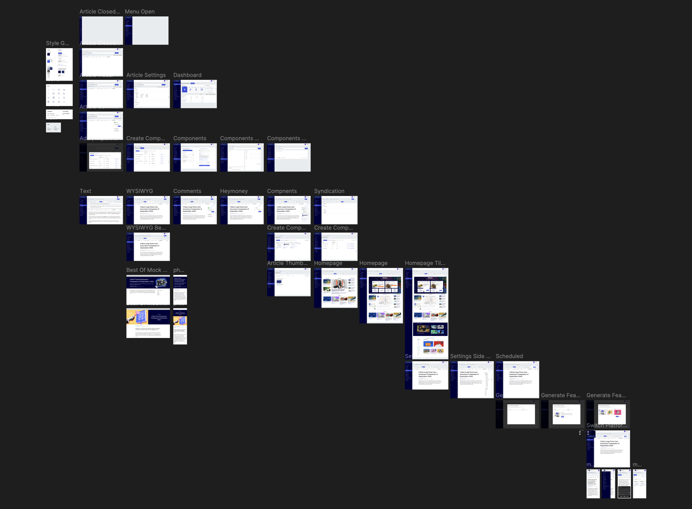
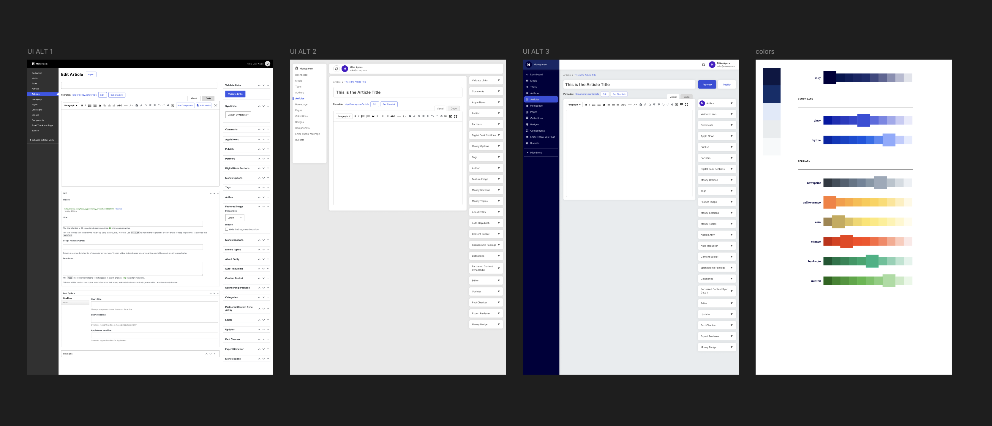
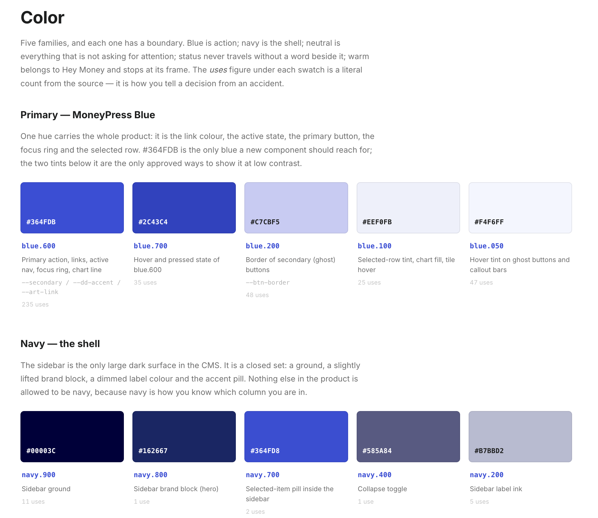
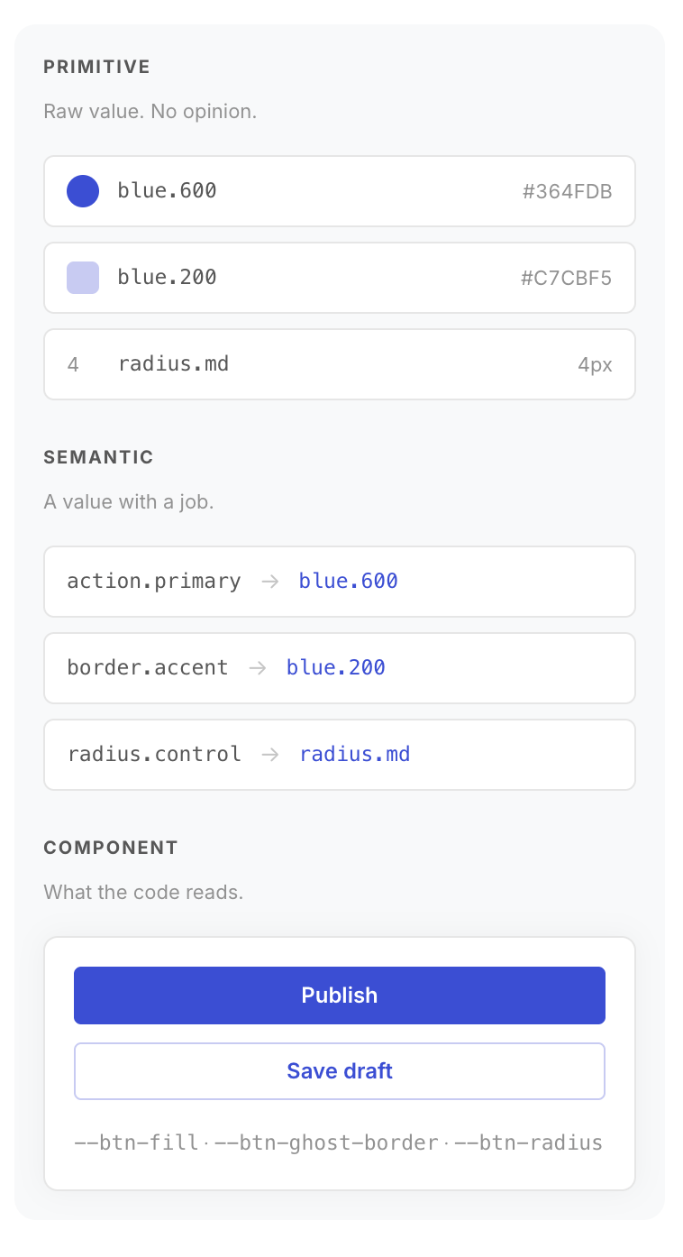
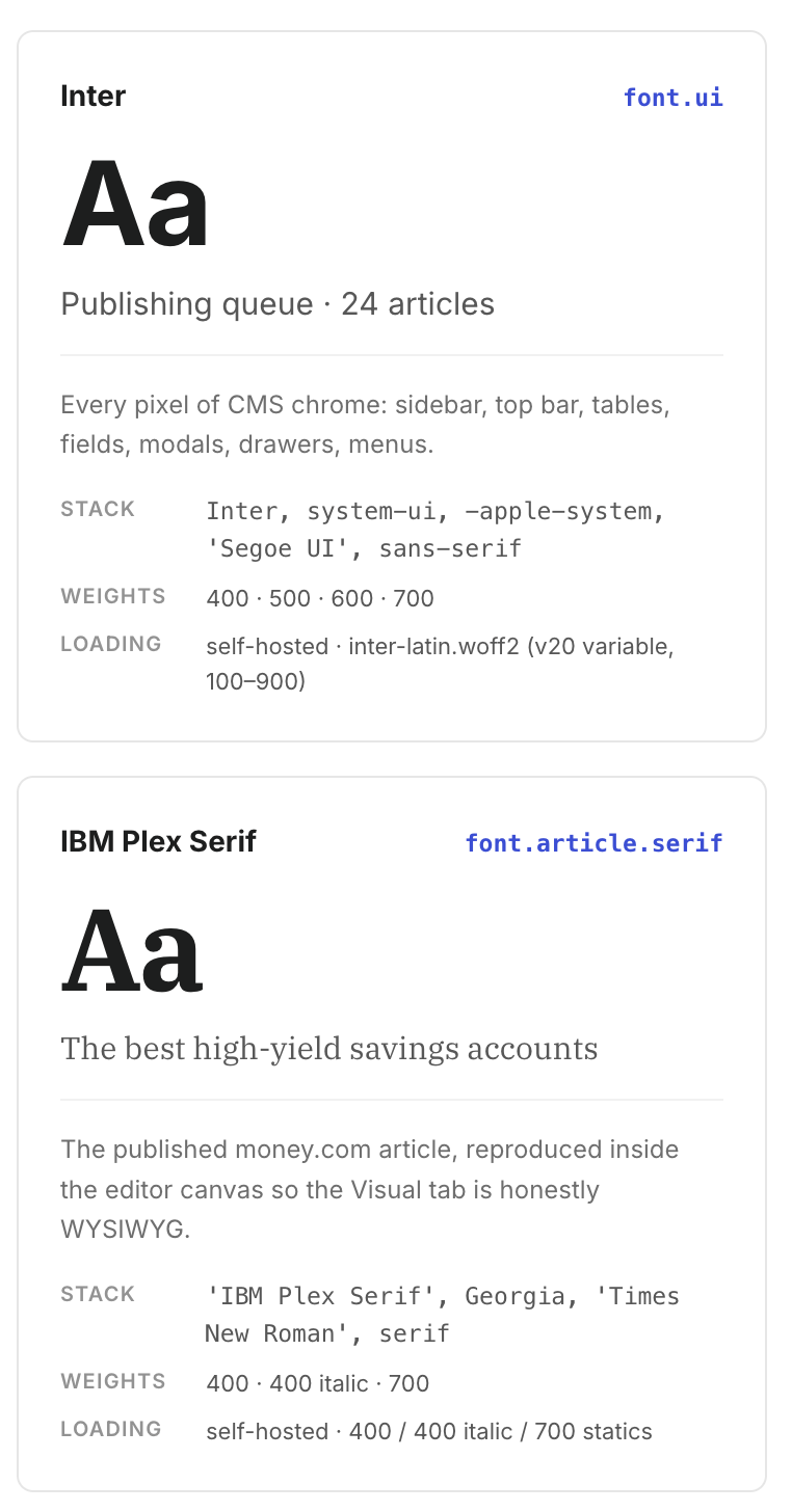
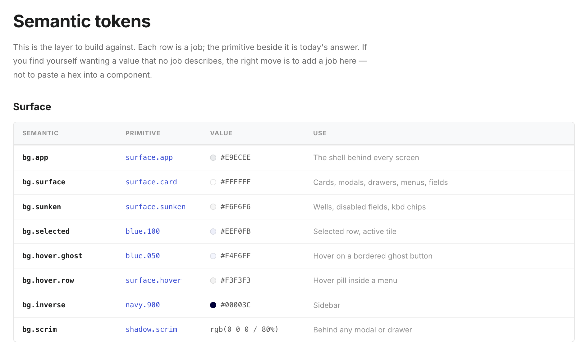
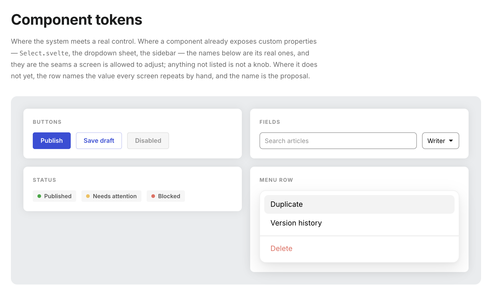
Started with pen and paper, then designed in Figma with a reusable design system, component library, and design tokens.
Desktop Wireframe Exploration
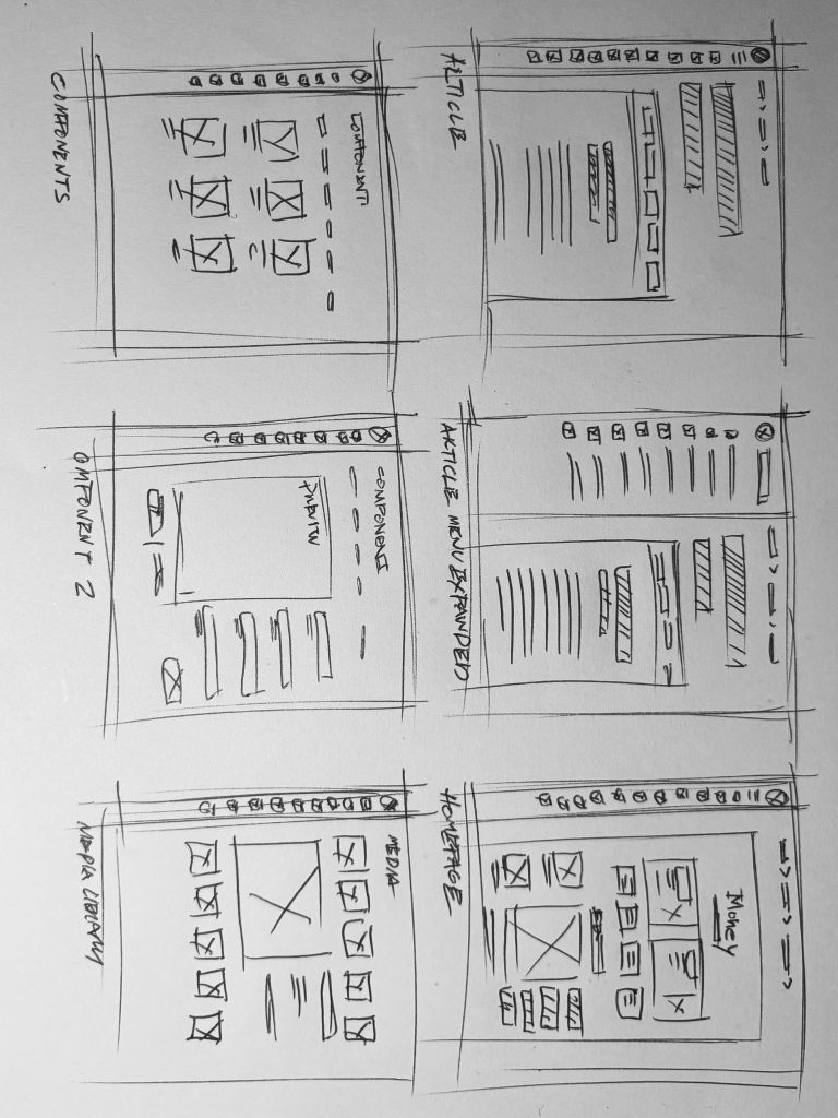
Mobile Wireframe Exploration
Design Exploration
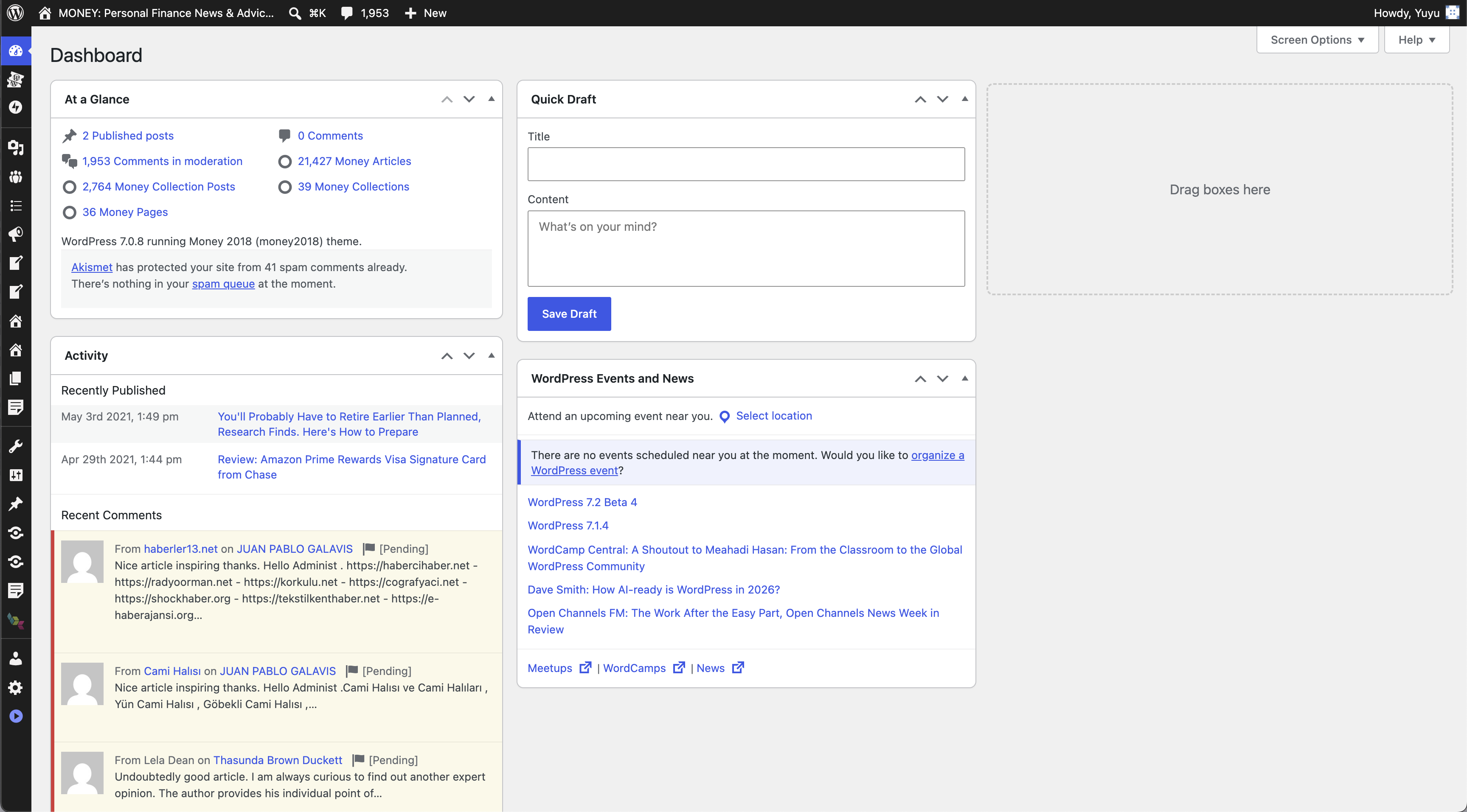
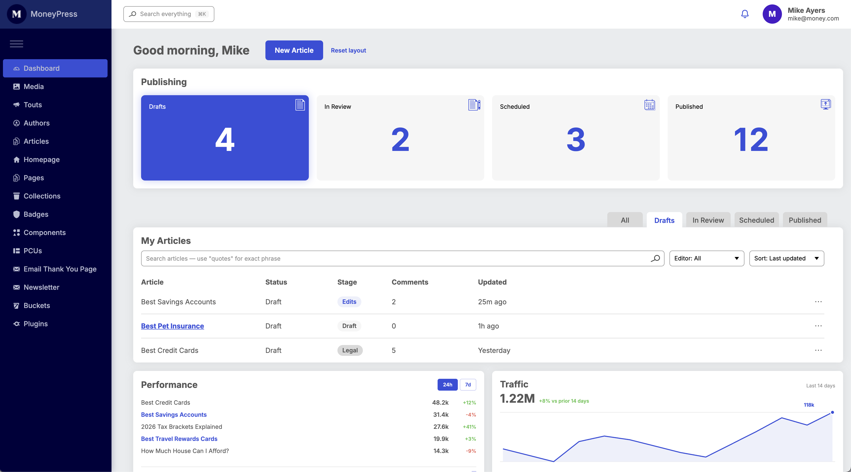
A dashboard built around the next action
Useful at a glance—not a second analytics platform.
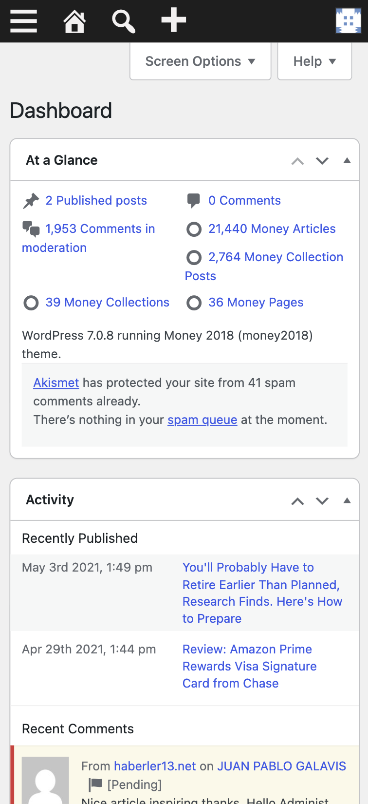
Original Wordpress Dashboard
Design intent
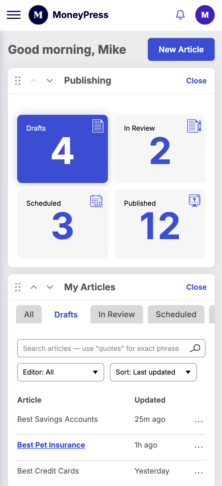
Help people find their work, see what needs attention, and continue publishing without digging through menus.
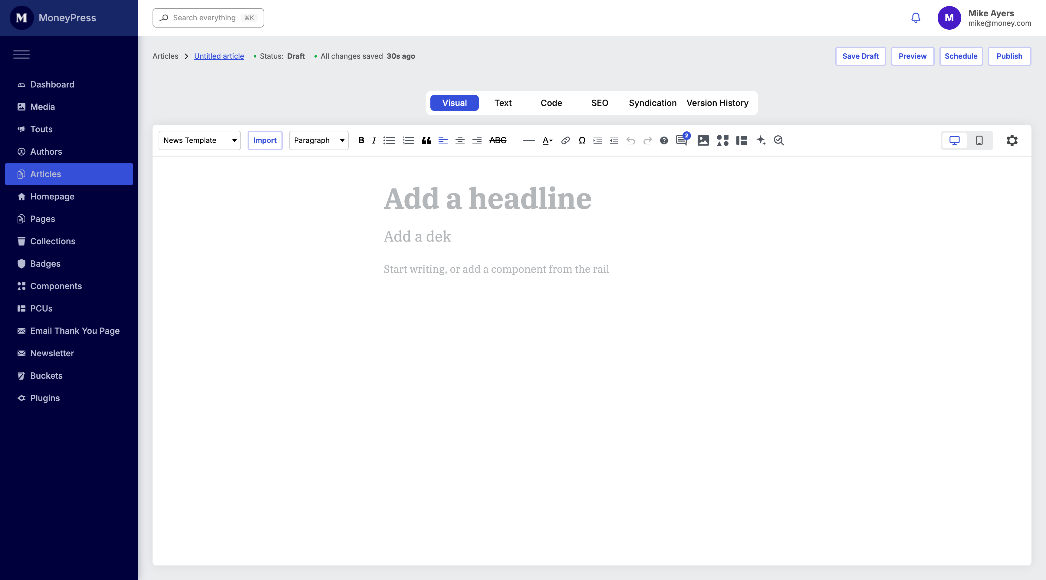
New Money CMS Dashboard mockup
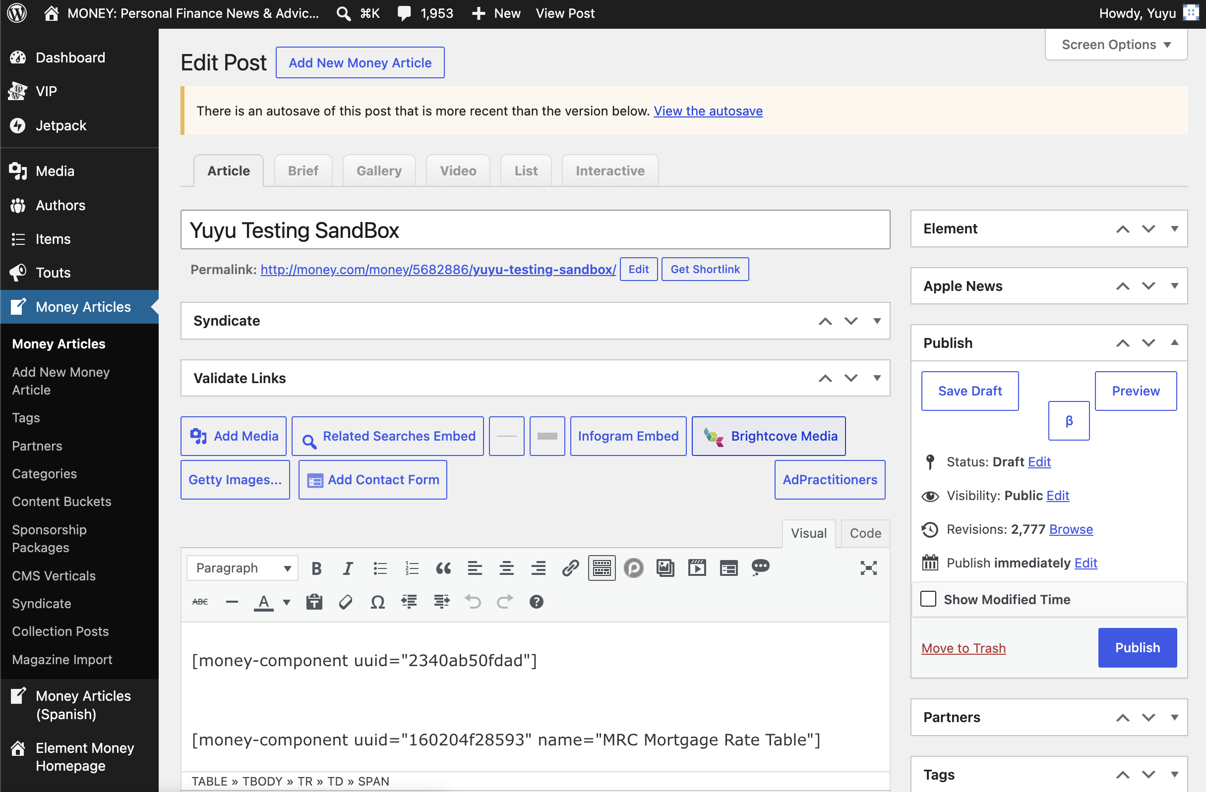
The editor as the center of the experience
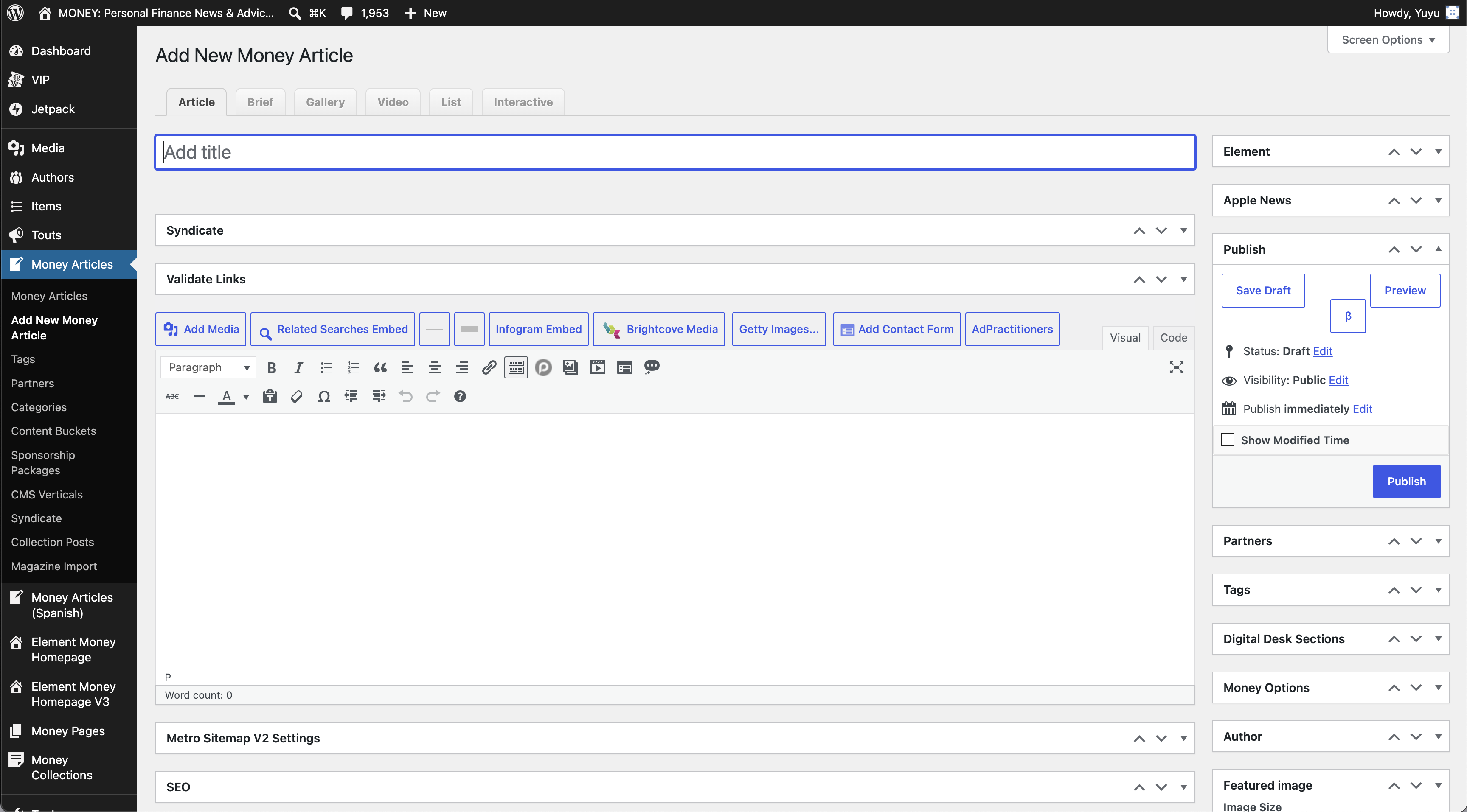
Keep the article—and the writer’s attention—at the center.
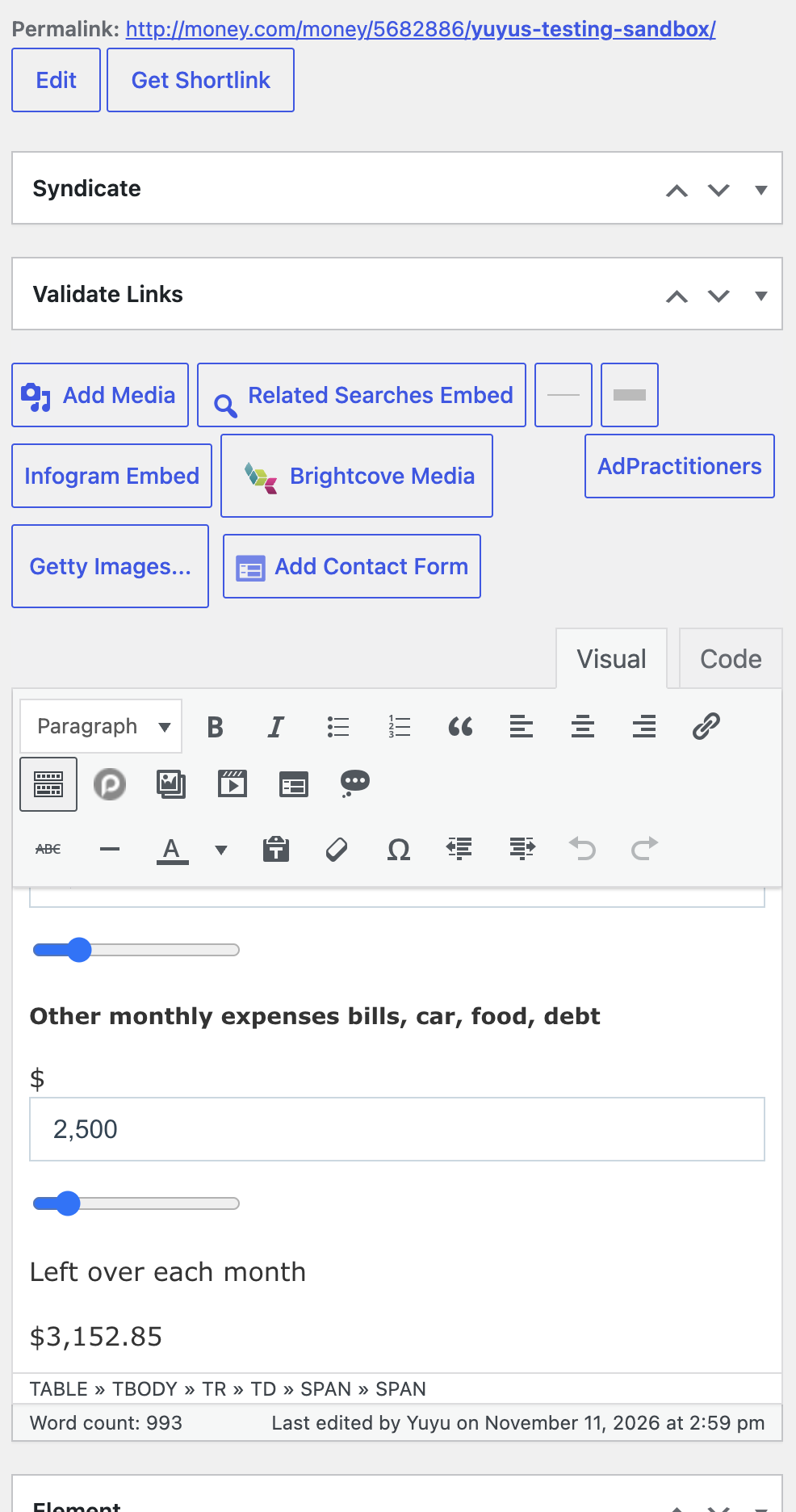
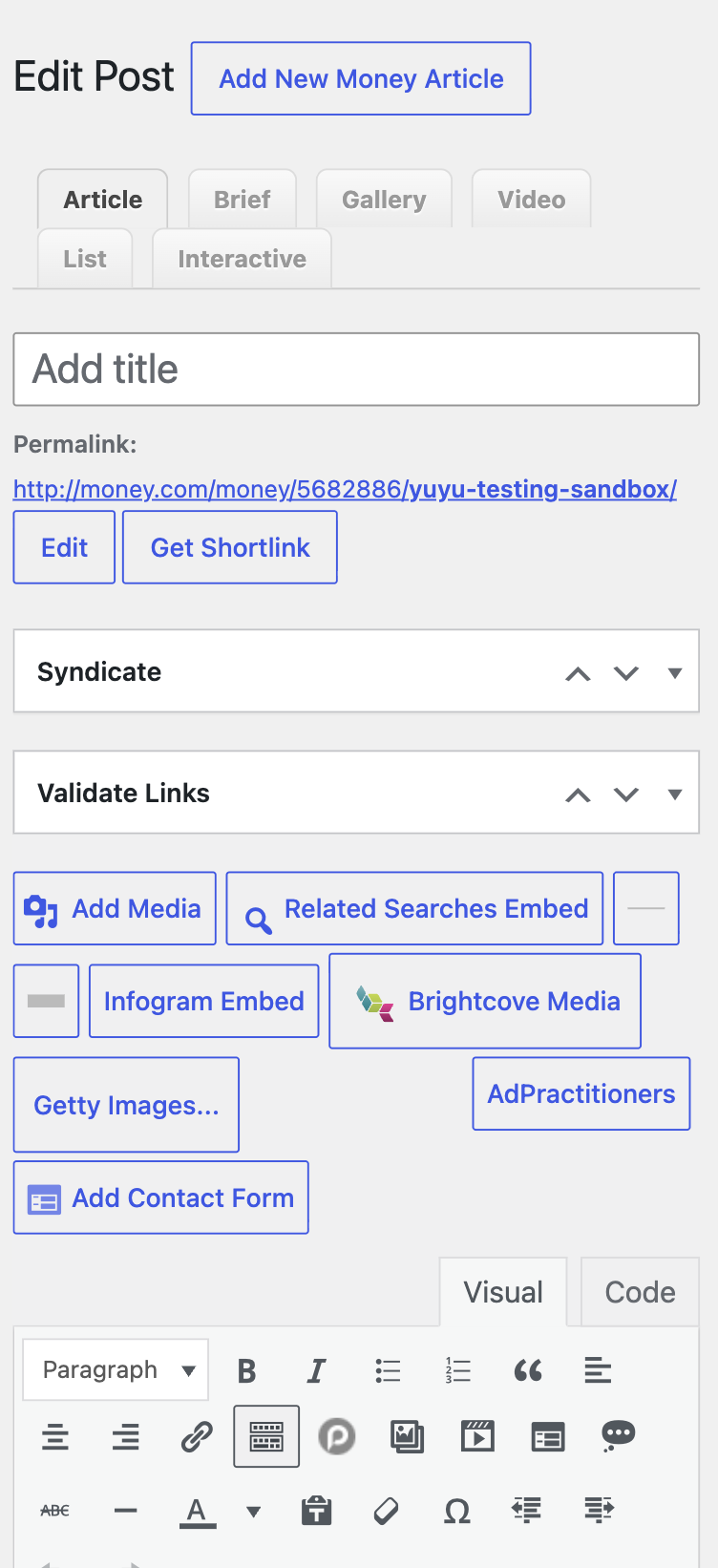
Original Wordpress Article Editor Screen
What the design explores
- A familiar writing surface
- Accessible content elements
- Contextual editing controls
- Clear review and publish actions
New Money CMS Article Editor Screen
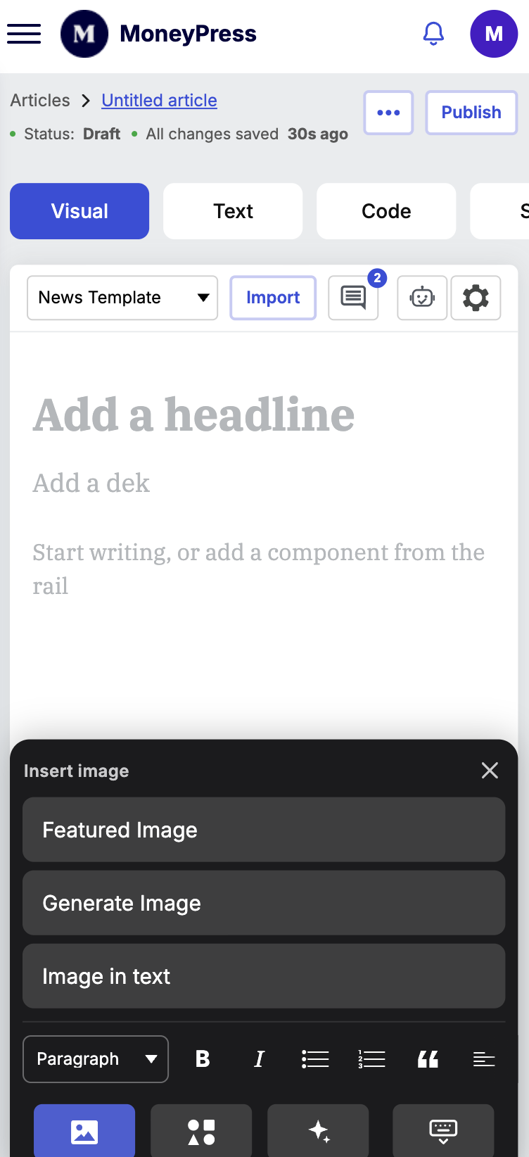
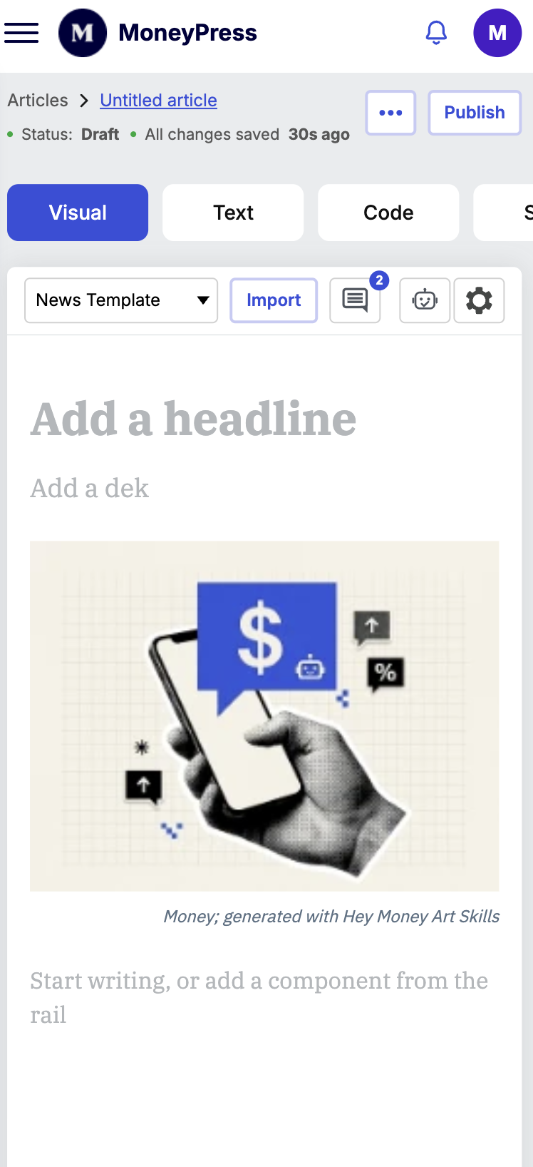
Prioritizing the Mobile Experience
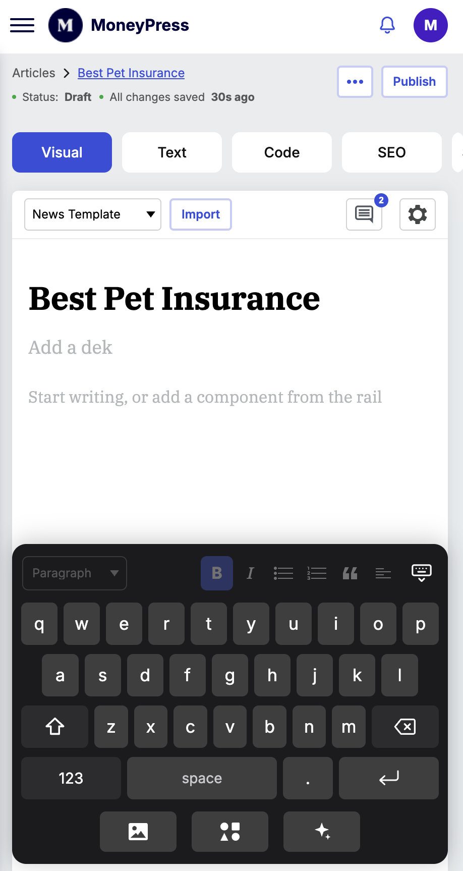
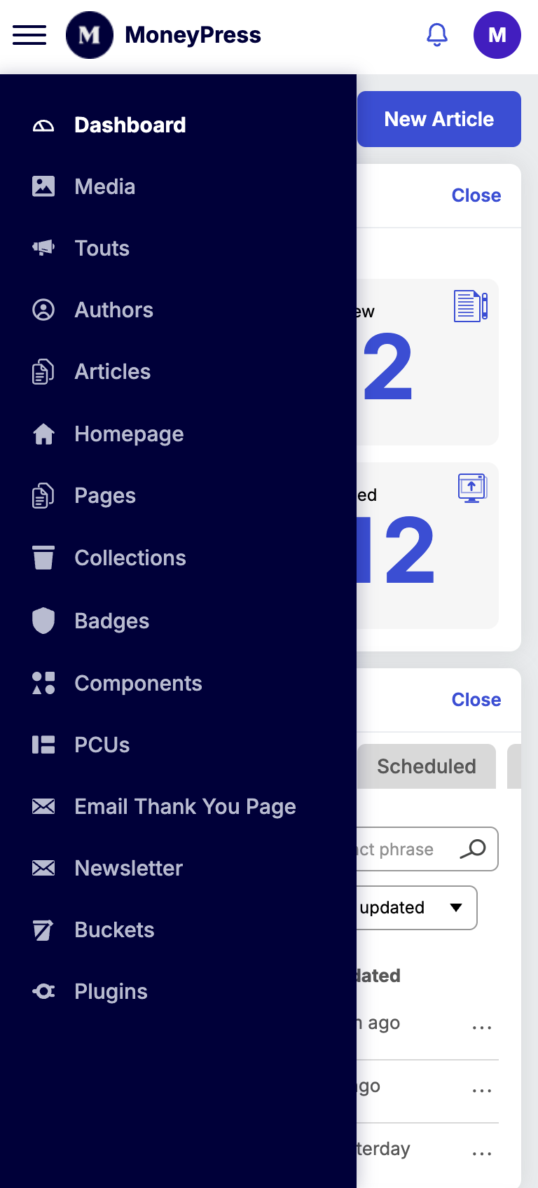
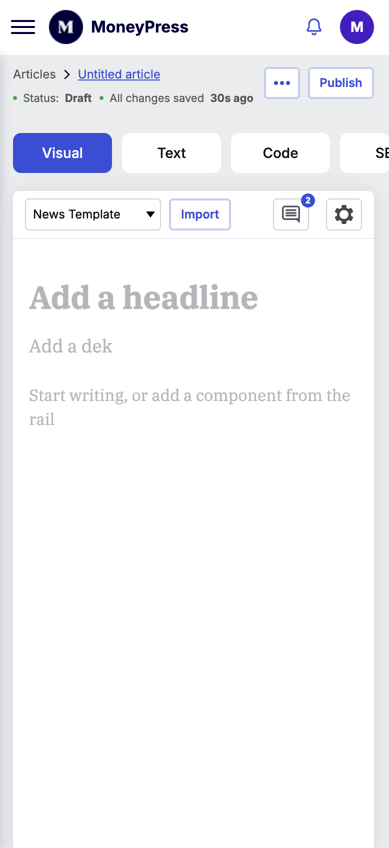
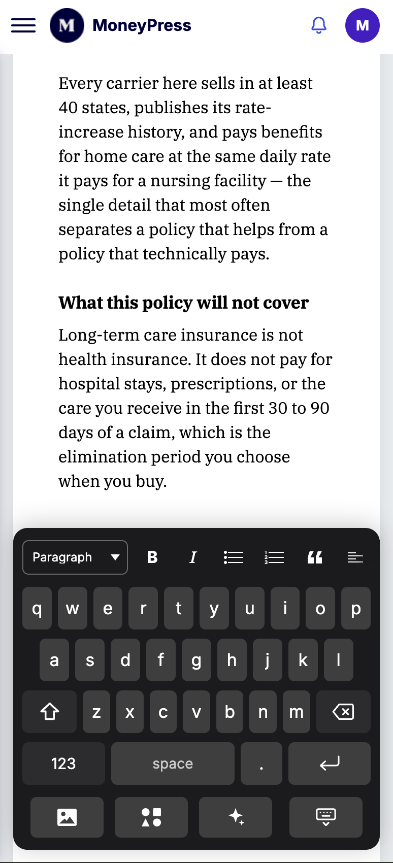
While ensuring every section of New Money CMS worked on mobile, I focused particularly on the article editor, where writers would benefit most from making updates on the go. I interviewed the editorial team's most experienced WordPress mobile user to understand his workflows, challenges, and needs.
These insights directly informed key design decisions: simplifying article updates, improving navigation, and creating a custom mobile keyboard toolbar that keeps essential editing and formatting tools easily accessible.
These insights directly informed key design decisions: simplifying article updates, improving navigation, and creating a custom mobile keyboard toolbar that keeps essential editing and formatting tools easily accessible.
Components without the shortcode mindset
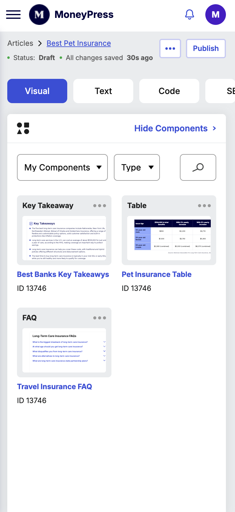
One concrete example of turning a pain point into an interaction.
Original Flow for a writer creating a component
1- Writer Logs into proprietary software to create component
2- Uses Google Authenticator to access software
3- Creates component, generates and copies shortcode
4- Enters Wordpress article
5- Pastes shortcode into article
Design hypothesis
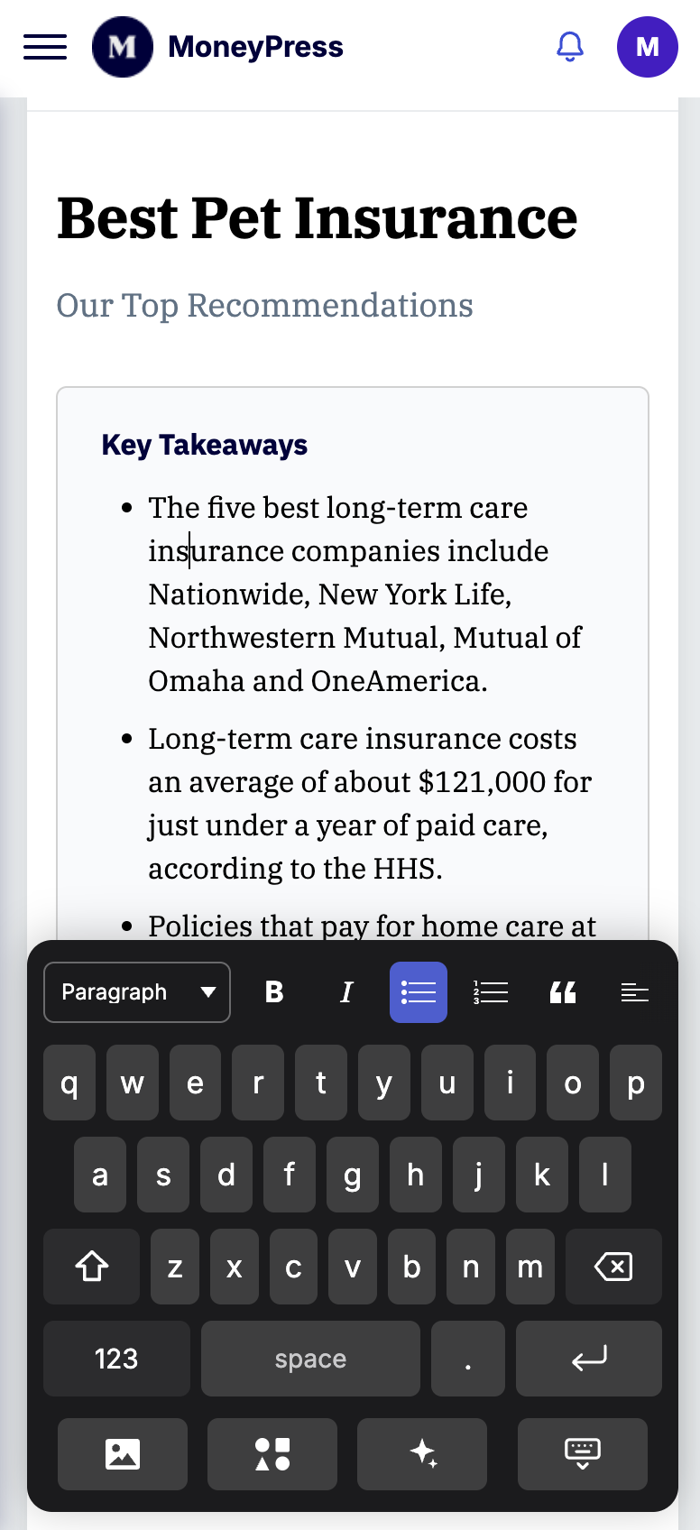
Fewer context switches can make content creation easier and less error-prone.
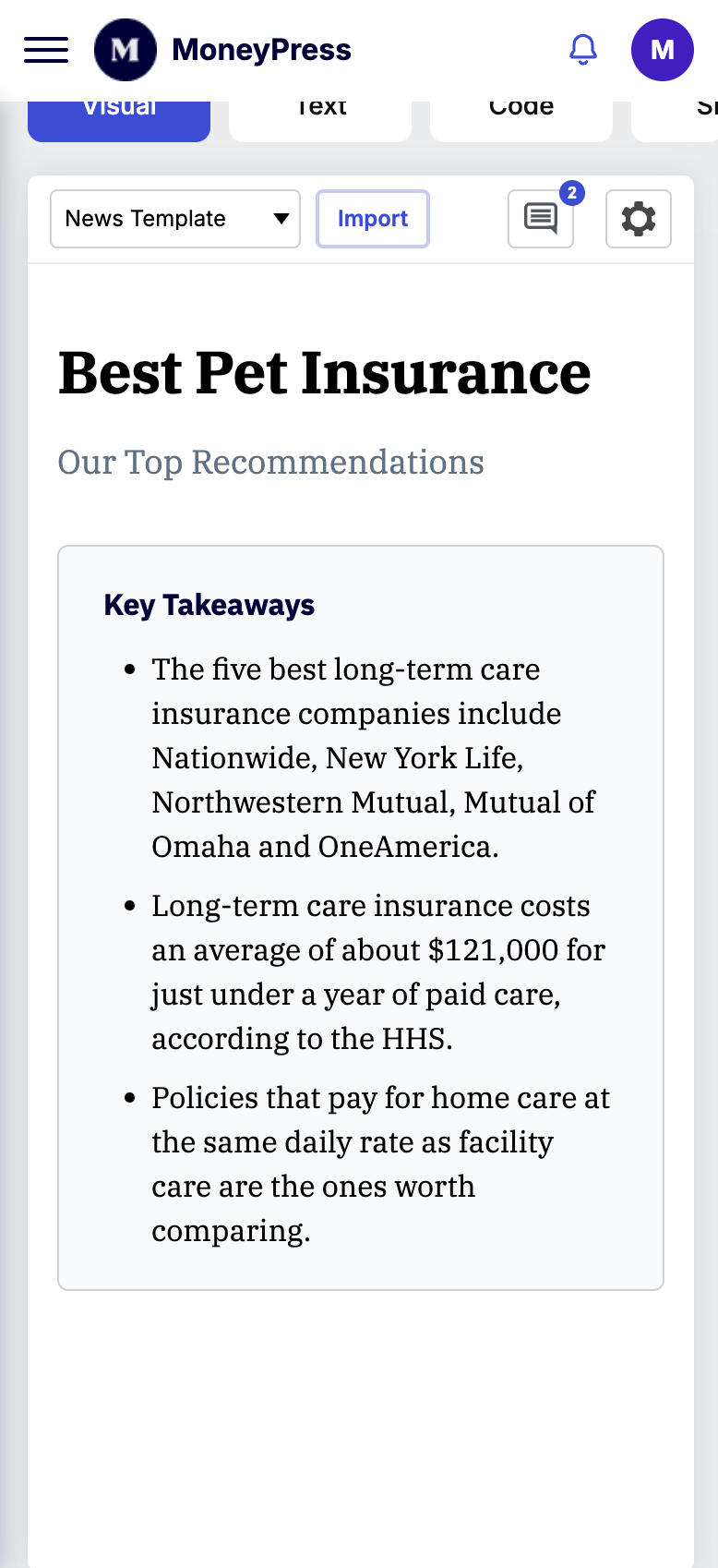
Step 1
Insert component type
Step 2
Edit in context
Step 3
Preview / reuse
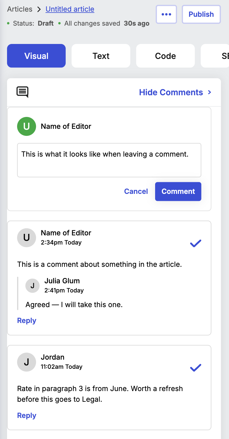
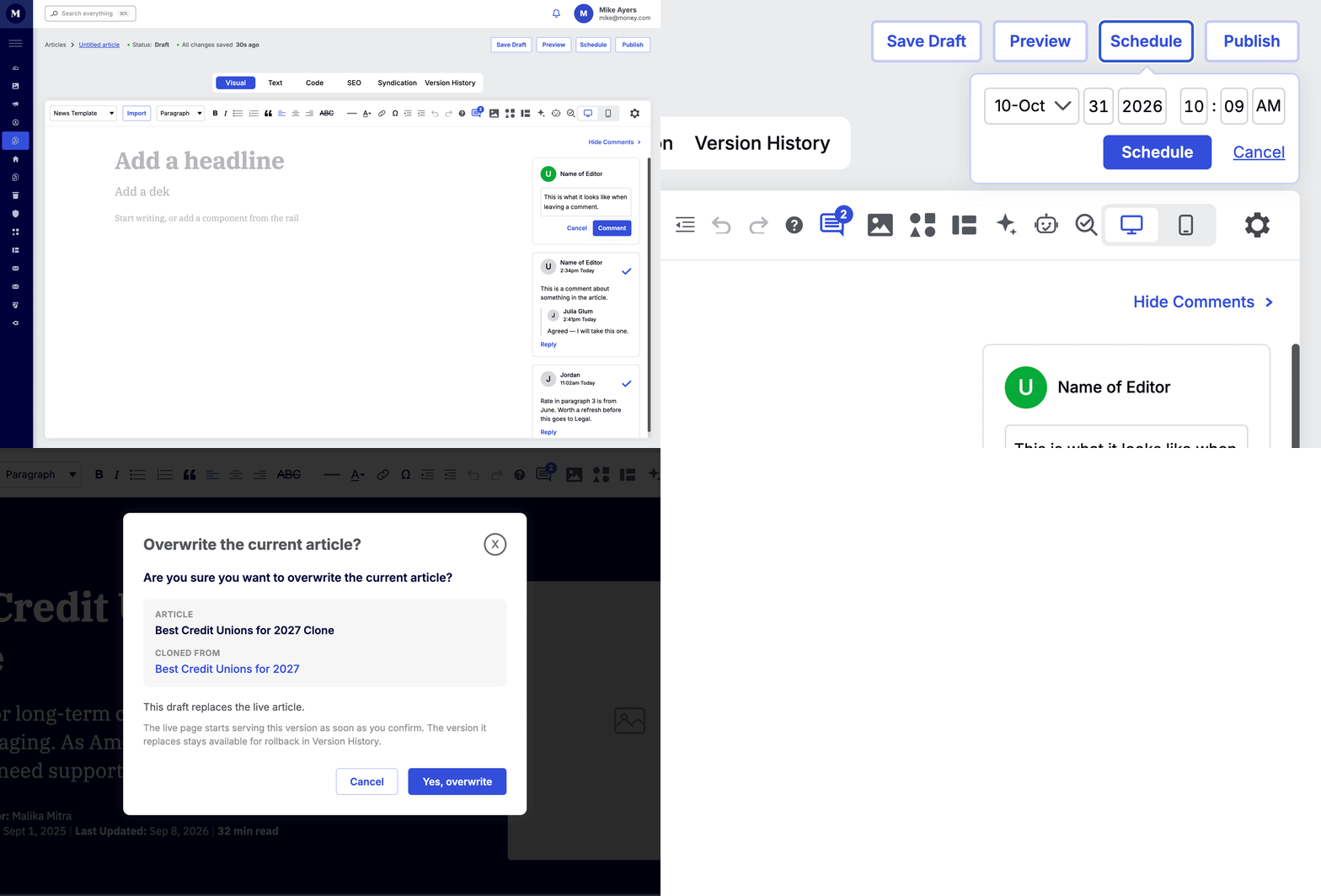
Collaboration closer to the content
Make review context visible without compromising publishing confidence.
Make feedback easier to manage by allowing comments inside the cms, instead of in a google doc.
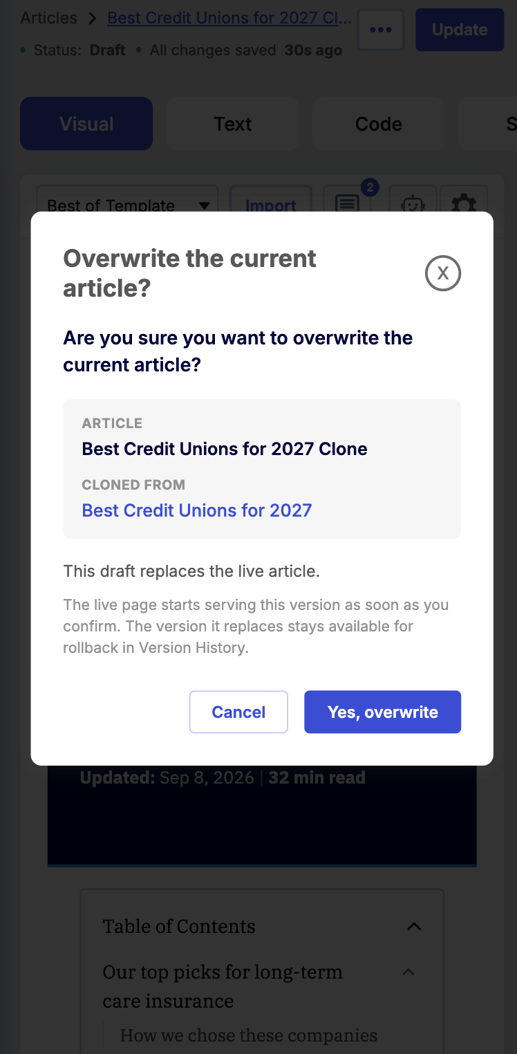
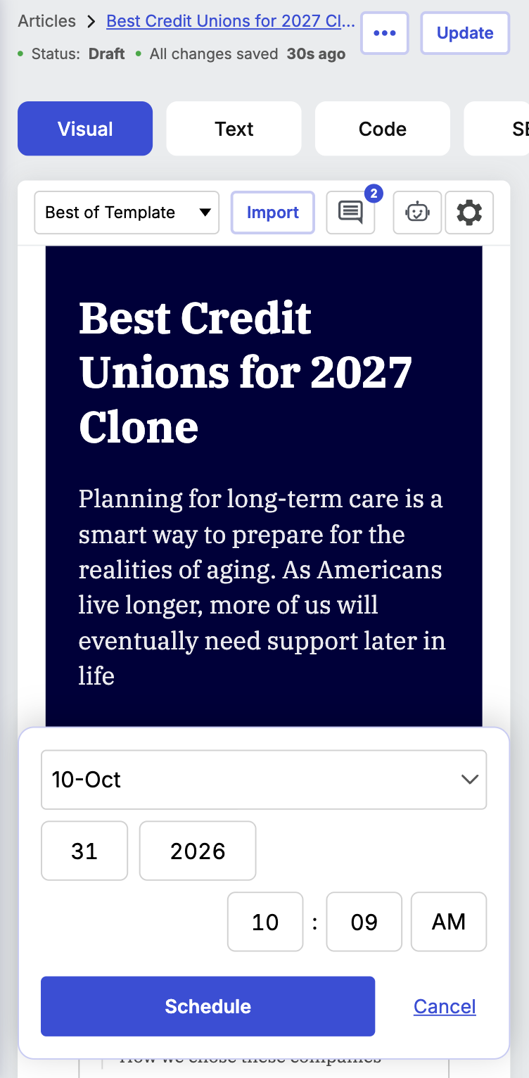
Keep safeguards that prevent
accidental publishing by setting a publishing date and including approval window before publishing.
accidental publishing by setting a publishing date and including approval window before publishing.
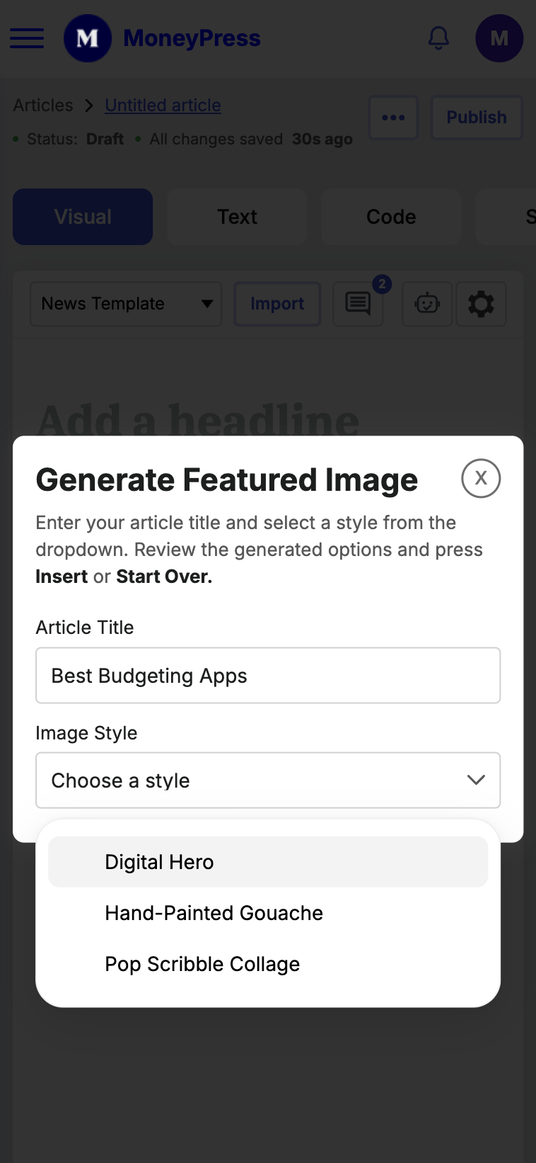
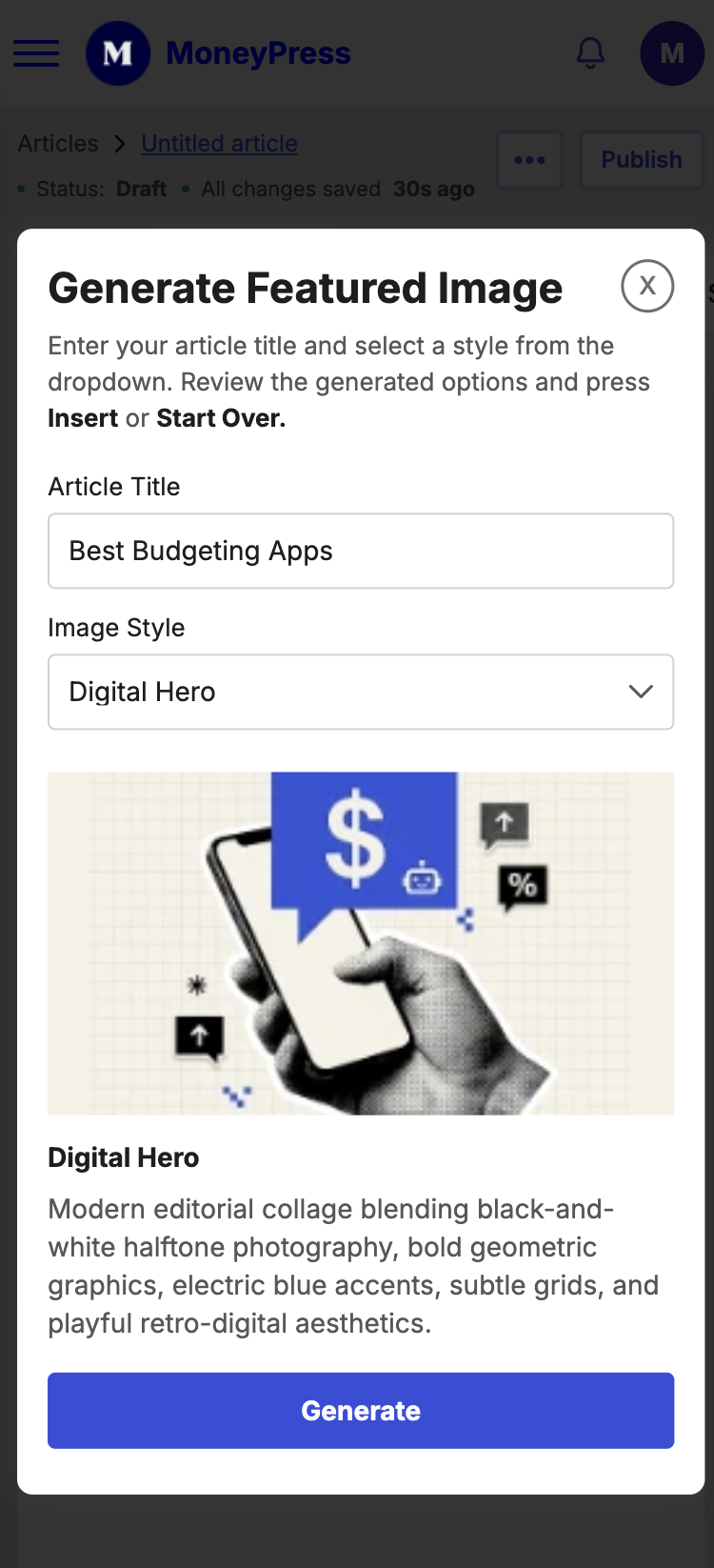
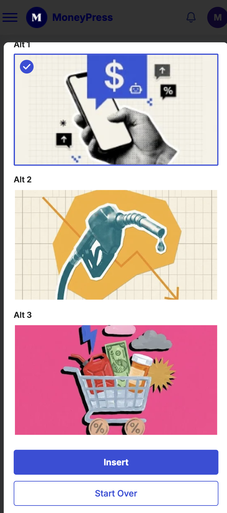
Creative flexibility, with guardrails
Give writers richer tools without turning the CMS into a page builder.
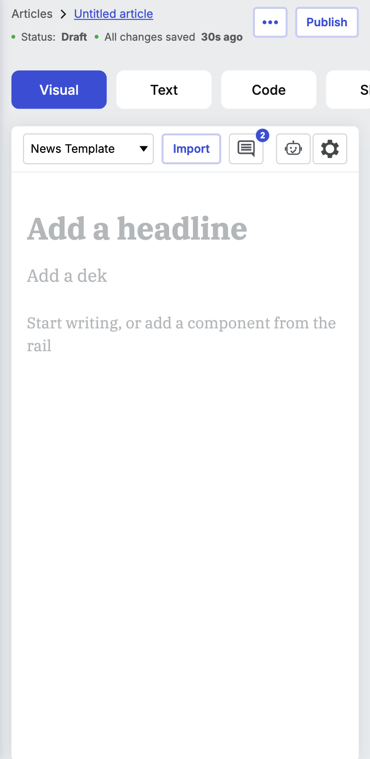
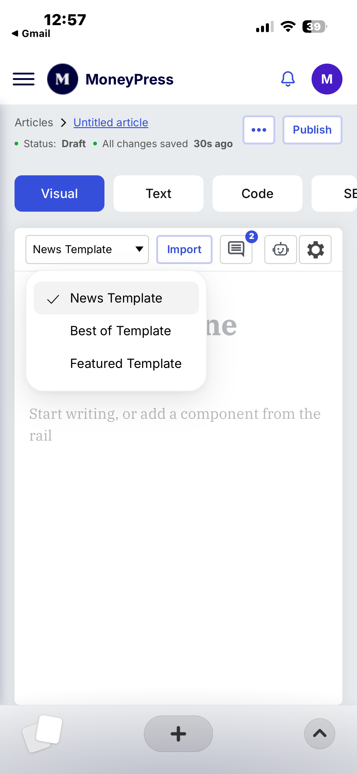
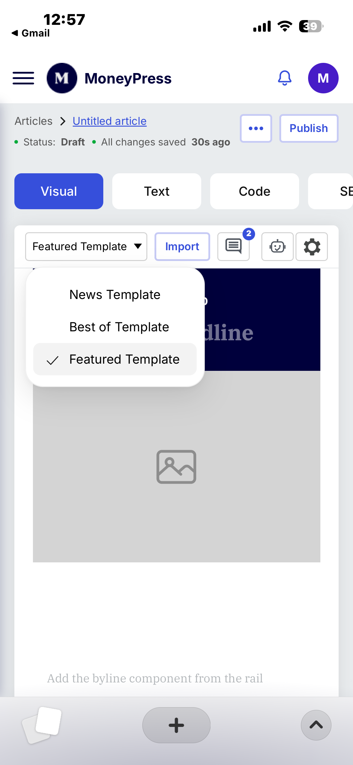
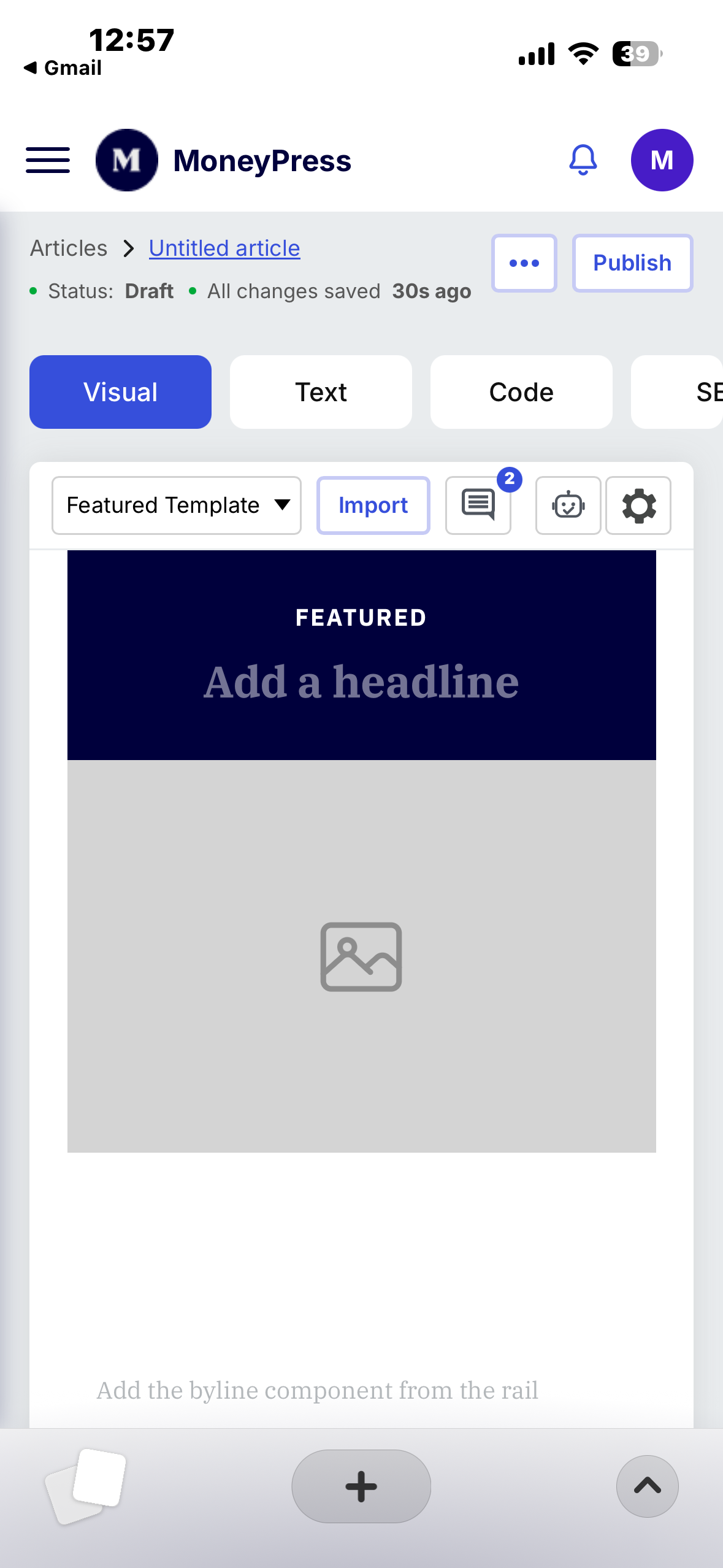
Article Template Selection
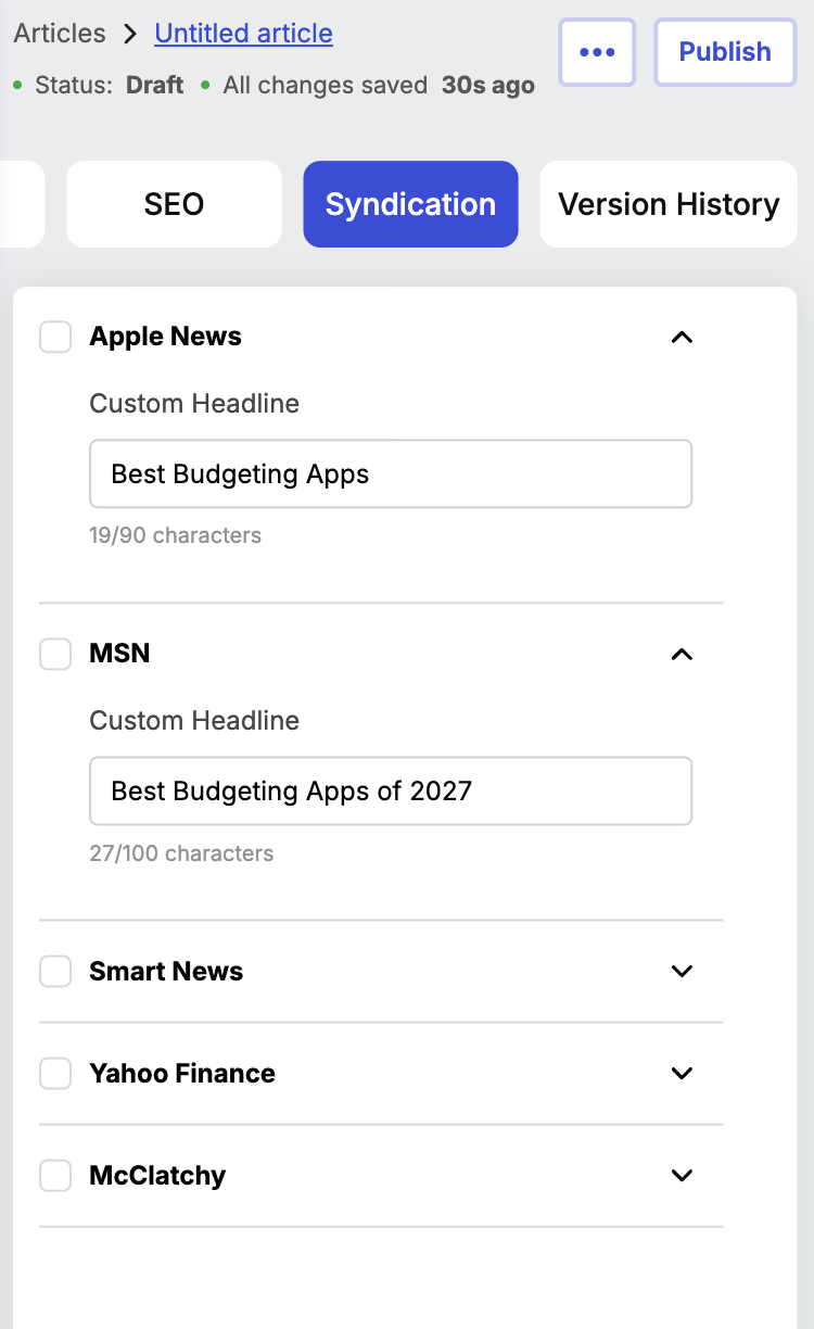
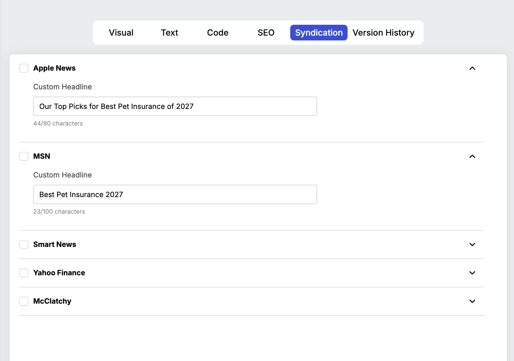
Alternate Syndication Titles
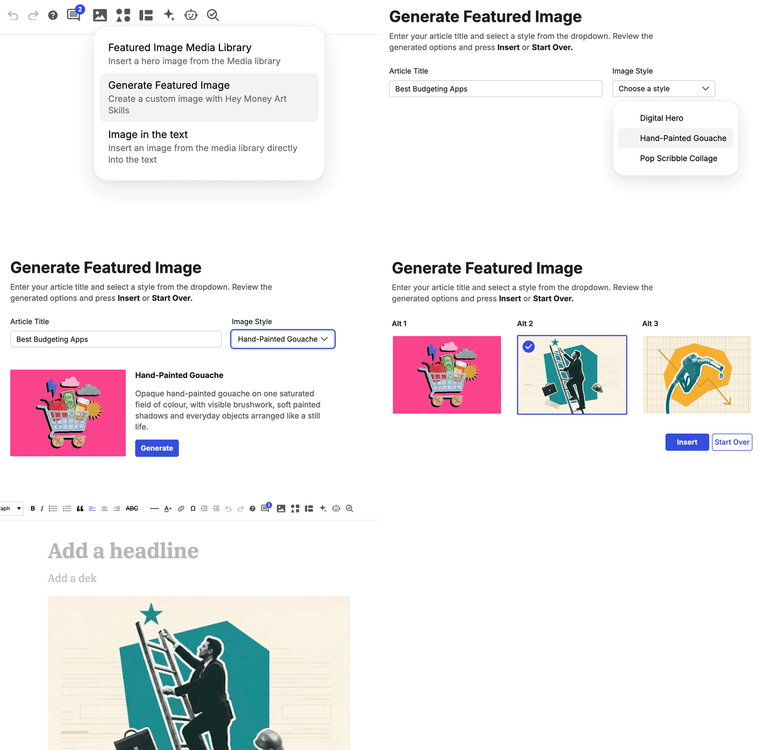
Image generation
Simplifying Homepage Management
The original homepage management experience was cumbersome and difficult to navigate, often requiring coding or backend knowledge to make even simple updates.
I redesigned it as a visual, WYSIWYG editor that allows team members to manage the homepage directly, swapping articles, updating ad placements, and adjusting content without touching code. The goal was to make homepage management more intuitive, accessible, and efficient, giving the broader team greater control over day-to-day updates.
I redesigned it as a visual, WYSIWYG editor that allows team members to manage the homepage directly, swapping articles, updating ad placements, and adjusting content without touching code. The goal was to make homepage management more intuitive, accessible, and efficient, giving the broader team greater control over day-to-day updates.
Wordpress Homepage Editor Screen
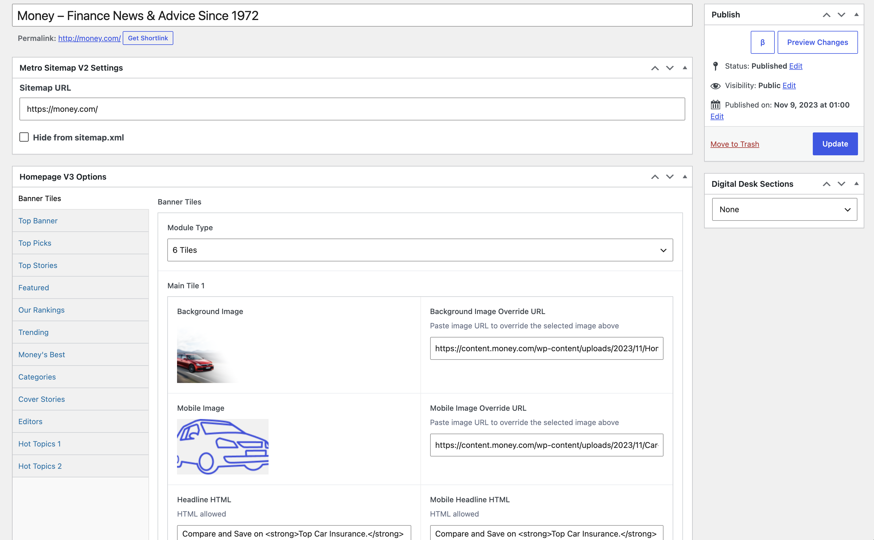
New Money CMS Homepage Editor Screen
Putting the prototype back in users’ hands
Built a functional, testable New Money CMS prototype with Claude AI from the Figma designs.
I brought the prototype to writers for usability testing to identify friction, gather feedback, and refine the experience. The response was overwhelmingly positive, with the team excited about the new direction. Only a few minor tweaks were requested, which helped inform the final revisions and prepare development-ready specifications.
Tasks observed
1- Find an existing article
2- Start or edit an article
3- Discover editing tools
4- Interpret publishing controls
5- Identify confusing language or missing
actions
2- Start or edit an article
3- Discover editing tools
4- Interpret publishing controls
5- Identify confusing language or missing
actions
From design to development handoff
In summary, I owned the product workflow—not just the interface.
Design Foundation
Built the CMS in Figma,
including reusable
components, design-system
rules, and tokens for
consistency.
including reusable
components, design-system
rules, and tokens for
consistency.
Iterative Delivery
Worked in prioritized sprints;
conducted writer testing and
incorporated findings into
subsequent design iterations.
conducted writer testing and
incorporated findings into
subsequent design iterations.
Engineering Readiness
Prepared final documentation
and implementation guidance
to support the development
team.
and implementation guidance
to support the development
team.
The Takeaway
A better publishing experience
starts with understanding the needs
of the people behind every article.
starts with understanding the needs
of the people behind every article.